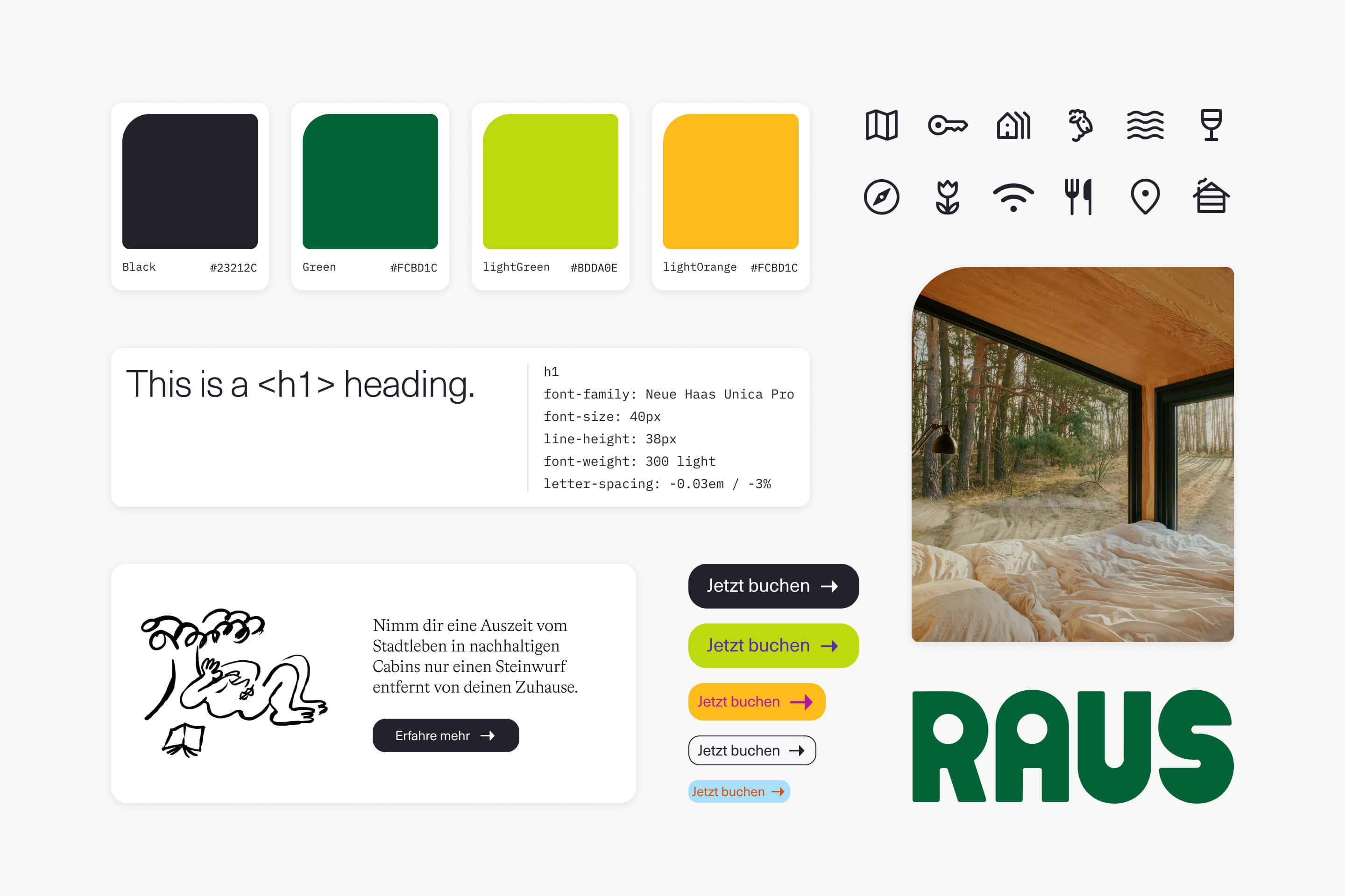
Building the foundation for an efficient workflow and a future design system.
Project kick-off
I knew we didn't have the time or resources to implement a proper design system right now, but I wanted to establish the first building block in this direction. I only had time to work on this when there was nothing else to do, which was actually pretty rare. I had to be pragmatic and use my time wisely.
I created a mini-roadmap with the features I wanted to implement, along with a list of steps to be done. This way, whenever I had a small chunk of free time, I could easily dive into this project and solve the next task on the list. I needed to be practical and focus on continuous intermittent improvement over time.
When I began this project, the website code served as the sole source of truth for design elements. I examined the code and extracted key variables such as colors and typography, which I then translated into Figma styles.
Colors
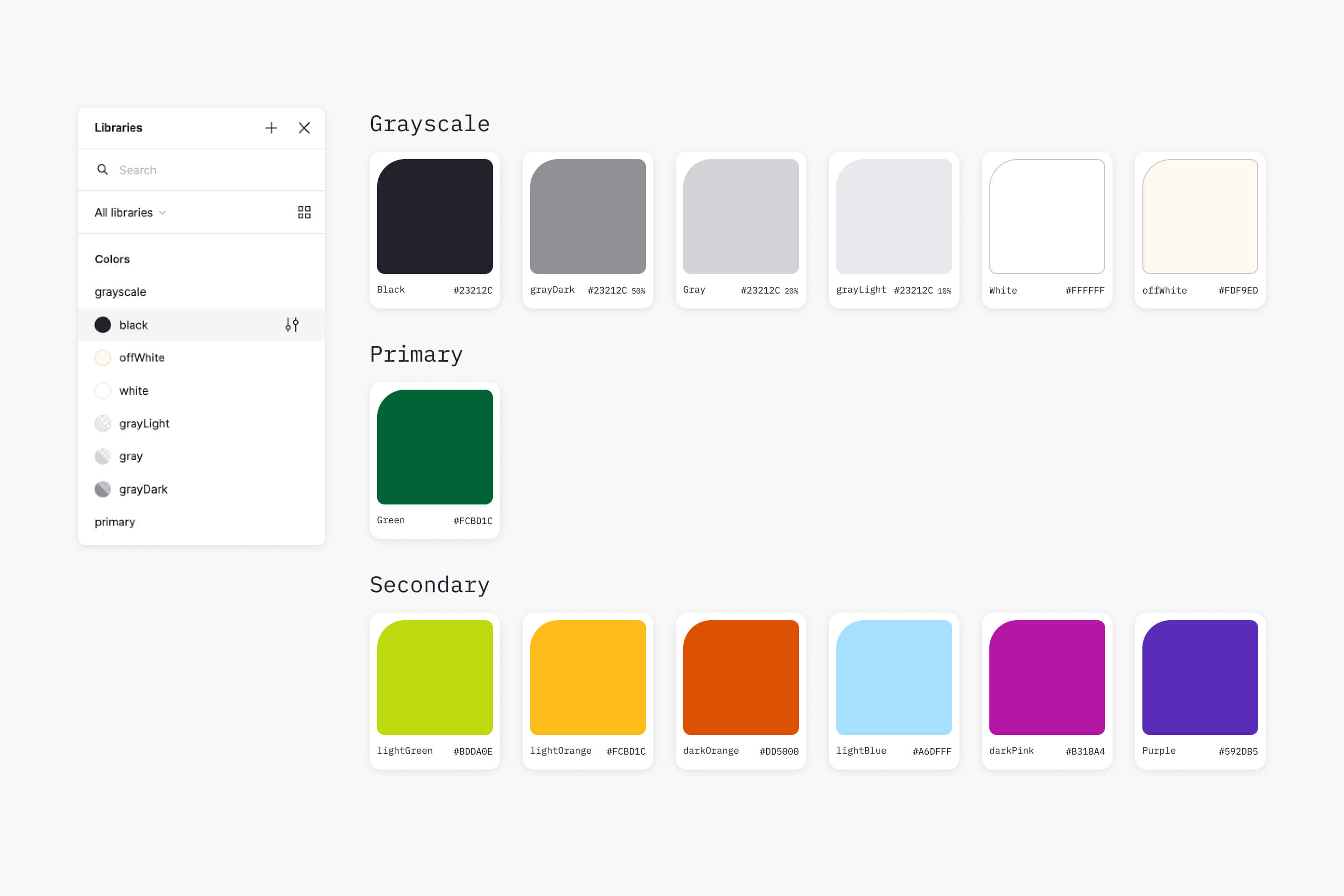
First, I separated the main parts of our design system into different Figma libraries. This way, we could activate or deactivate the libraries as needed, instead of having one large library for all the elements.
I decided to start with colors, as they seemed the easiest to accomplish. They were already saved as variables in our codebase, so I just needed to copy the color values and save them in Figma as color styles.
Typography
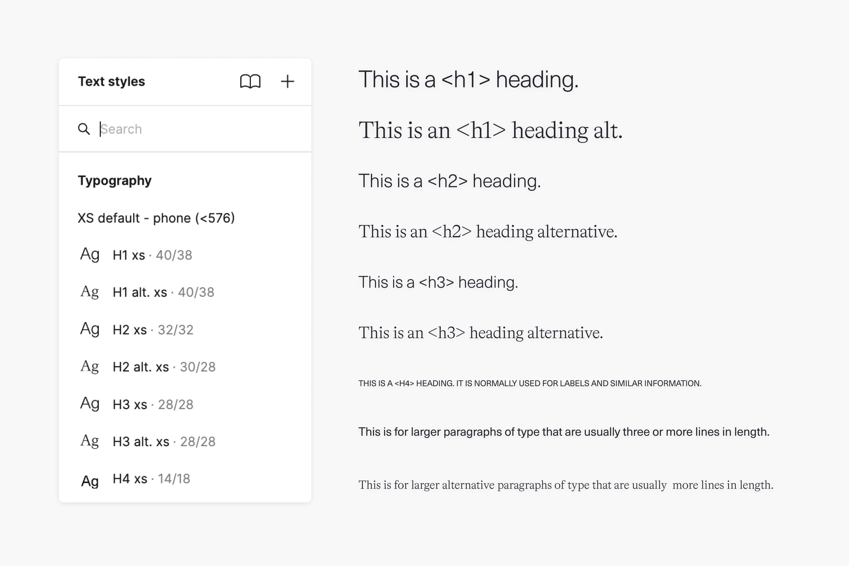
Next up was typography, and this one was a bit tricky. Since Figma doesn't support responsive typography, I had to be practical and find the easiest way to handle it.
After some technical analysis, I created a type scale based on the established breakpoints of the website. For convenience, I included the breakpoint name, the device, and the range of pixels used.
Bringing uniformity with a new icon library
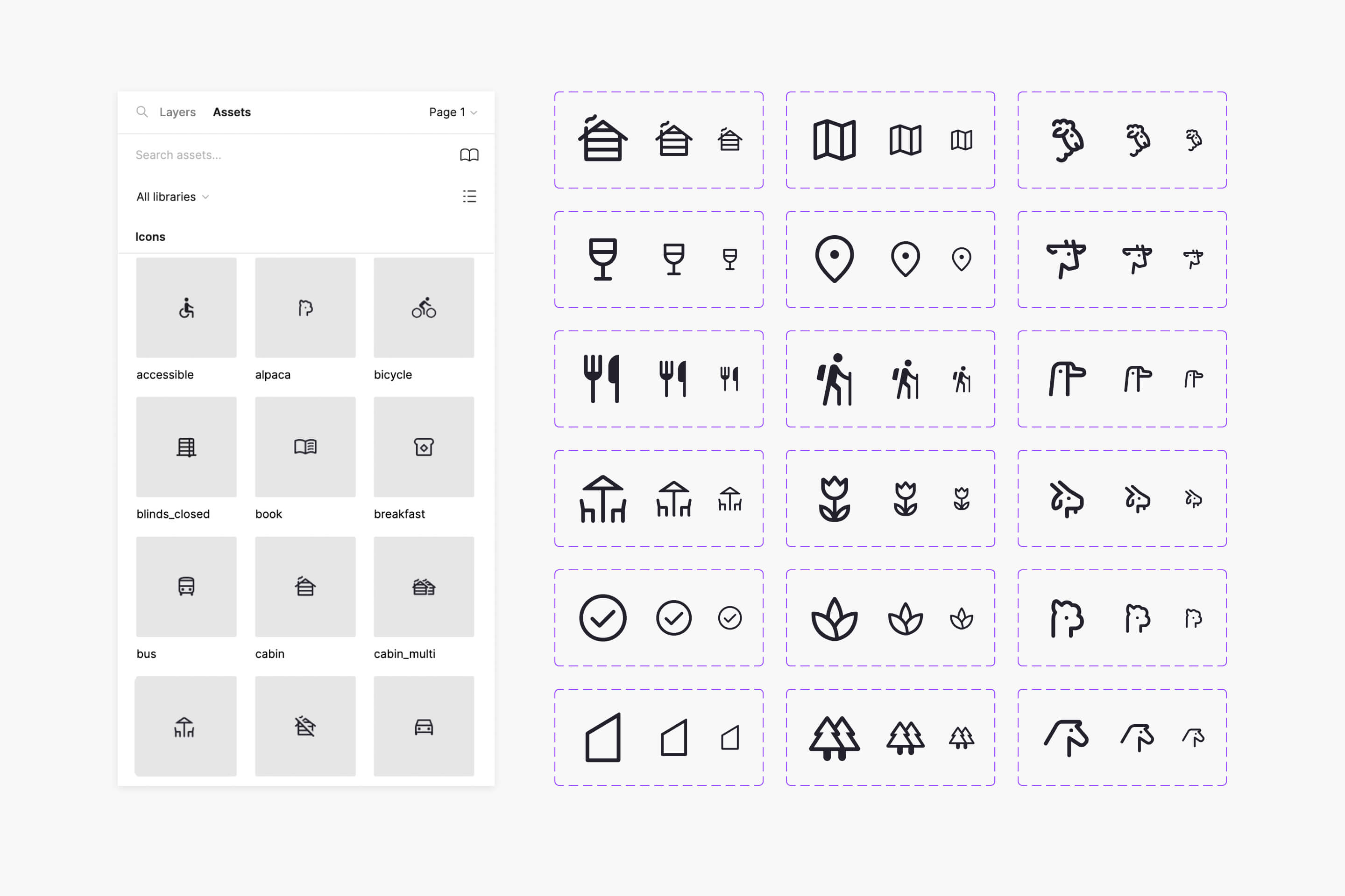
Another challenge I encountered was the lack of a unified icon library. Whenever a new icon was required, it was sourced from a different random collection. As a result, icons ended up with inconsistent styles.
To solve this, we decided to implement a new unified icon library. Given the time constraints, we searched for an existing library that met two key criteria: a vast collection of high-quality icons and a style similar to our current icons.
We settled on the Google Materials Symbols icon library. With over 2500 well-designed glyphs and a handy Figma plugin, it is incredibly easy and fast to use.
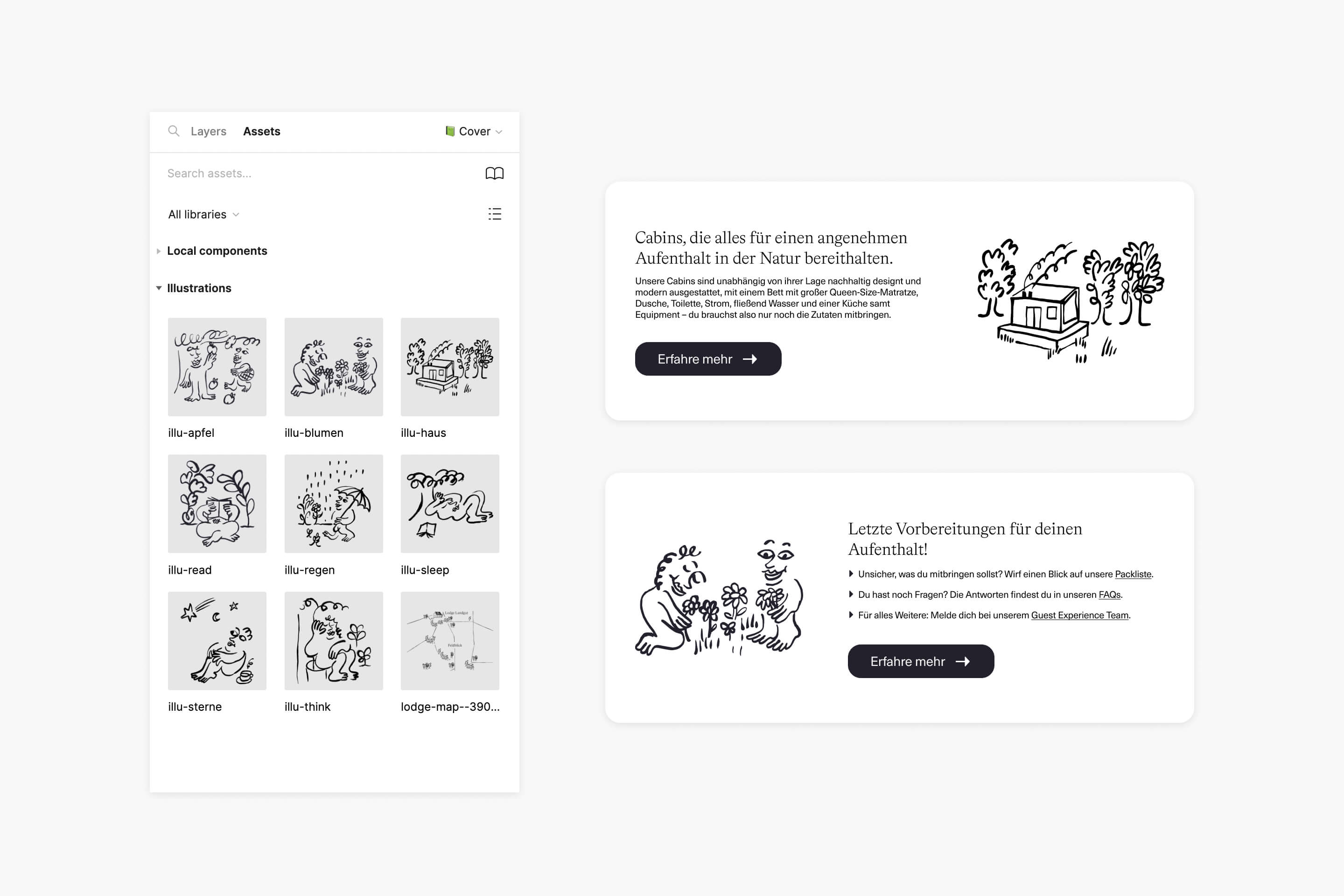
Brand Illustrations: vectorizing for versatility
Our brand illustrations, created by the talented Olga Prader, are crucial assets for our branding. They have a unique and cool vibe that helps us to differentiate ourselves from our competitors.
But there was a small challenge: they were in a non-vector format, which could be impractical for future uses and on the web. Luckily, the illustrations were provided in large tiff files.
I took the opportunity to vectorize these illustrations and also saved them as components in Figma. Now, with a simple drag and drop, the illustrations are readily available for us to use. And no more heavy .png files on the web, now the illustrations are in practical .svg format.
Results
- ✅ Built the foundation for a future design system.
- ✅ Making final designs for productions was much faster.
- ✅ The new icon library was a total success, fully implemented across our entire website.
- ✅ A few months later, we launched our own apparel shop, incorporating the illustrations into our clothing line. The vectorized illustrations proved to be a great time saver for production.
Lessons learned
Even though I was already quite fluent in Figma, working on this project taught me new ways of doing things and implementing better workflows in Figma.
A few months after this project, Figma launched a major update related to variables, transforming the way design systems are created. It was a bit of a pity, but it also opened new possibilities in how to create and manage design assets.
Next step is implement the new Figma variables feature for spacing and border-radius.
